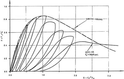
For my analytical work, some of the best experimental datasets for numerical validation date back to the 1950’s. Ultimately I will want to plot the response of my numerical models against these experimental results, but often these results are only accessible in a format
I need to digitize this graph, but how?
A quick Google search reveals a lot of software which is either a plugin to an expensive package I don’t have, deprecated shareware, an open source project which I’ll need to compile from source, Windows only, etc. To all of these, I must regretfully say “no thanks.” Buried in the results, though, I saw a little program called ClickGraph ($8 USD). While the more expensive options provide a lot more automation, this simple tool was exactly what I was looking for.
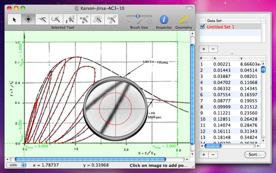
To digitize a graph with ClickGraph, you simply copy a screenshot of your graph to the clipboard and paste into the main window. It asks you to input the four coordinates bounding the plot area, and then you trace the curves. There is an auto-detection feature which I didn’t have great success with. Here’s a rough pass on a graph I’m using in my research.
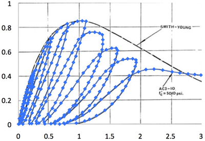
After defining the curve, the data is exported to plain text. I thought I should make sure the results were accurate, so I created a quick xy-scatter in Excel which I superimposed on the original graphic. So far so good:
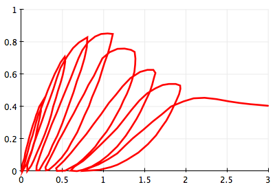
Now, I can process or present this data however I like. For publication quality graphics, I would recreate this one in higher detail, but for the trial run, this is great. Here’s how it looks in OmniGraphSketcher (which I adore).
So there you go, great solution for $8. Still tedious, yes, but less tedious than printing out the article, drawing gridlines, and manually entering the data points (ahem, which I may or may not have done once). If had to do this more often, I’d pay for an option that does a better job auto-detecting curves. But on a graduate school budget, this one is a win.
To those of you who have done this before, please do pass along your best practices.
-
This applies not only to older documents, but also to newer ones where results are graphically presented without access the raw source data. Until researchers begin making more data publicly available, this is a problem. Another topic for another time. ↩