I love niche writing. I have sometimes subscribed to blogs devoted to topics I care next to nothing about, just for the enjoyment of seeing the passion of a community over random details that nearly the entire world doesn’t care about
Typography is one such subculture. You wouldn’t believe how volatile a message board can become arguing the virtues of different variations of Bembo.
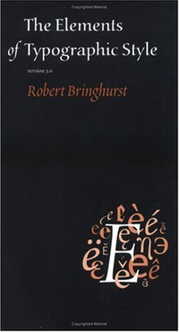
I’m currently reading Robert Bringhurst’s The Elements of Typographic Style. I just finished a section dealing with horizontal motion in typography, which addresses kerning and a host of other things you never knew existed.
The last section contained this gem:
Lists, such as contents pages and recipes, are opportunities to build architectural structures in which the space between the elements both separates and binds. The two favorite ways of destroying such an opportunity are setting great chasms of space that the eye cannot leap without help from the hand, and setting unenlightening rows of dots (dot leaders, they are called) that force the eye to walk the width of the page like a prisoner being escorted back to its cell
2.
Robert Bringhurst cares more than you do.
-
I may or may not have once subscribed to a blog devoted exclusively to reviewing mechanical pencils. ↩
-
Bringhurst, p. 35 (emphasis added) ↩