I’m sure many readers of this blog follow Nathan Yau’s website, FlowingData, which is one of the most popular blogs on data science and visualization. When I heard about Nathan’s book, Visualize This, I had to have a copy.
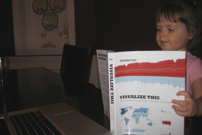
It turns out I’m not the only one in my house who likes it:
First of all, my hat is off to Nathan for producing such a great work during graduate school. Most graduate students are struggling to survive—meanwhile here is Nathan doing all the things grad students have to do… and writing a hugely-popular blog and beautiful book. Well done, man.
This book strikes a fascinating balance. It provides a great high-level (not “Tufte” high-level) overview for someone who wants to get started in visualization. I’m envisioning someone who has begun paying attention to infographics in Wired or the New York Times and wants to start making them. There are a lot of tips so basic and straightforward that I think anyone could produce their first graphic with just this book in hand. And to help you get off the ground, you can download a collection of code and datasets from Nathan’s website to try out various exercises throughout the book.
But on the other hand, there is a lot in this book for more experienced analysts. If you are already proficient with tools like Matlab, Python, or R, this book will initially appear really basic. But as I began working my way through it, I realized I was having a lot of “so that’s how you do that” moments. There were a number of tools featured (especially some of the geographic visualization platforms) that I had never heard of—several of which I was actually in the market for.
It’s a good thing when engineers, scientists, and generally analytical types are exposed to design principles like you are in this book. Our background trains us to get the data plotted as quickly as possible before moving to the next thing—without even cursory effort applied to asking if we could better tell the story, whether different design elements could better demonstrate relationships or causality. Nathan offers a lot of practical guidance in this arena.
I do have one gripe. Nathan post-processes all of his graphics in Adobe Illustrator, which is no doubt the de facto professional standard. But he suggests Inkscape as an alternative while saying, summarily, “I’ve heard good things about it.” I found this really unfortunate because one of the main things I wanted to gain from this book was practical guidance how to post-process the raw output from R or Python into something more attractive. Illustrator is way out of my price range, especially when the analysis tools I’m using are open source. I was hoping to find out if Inkscape was worth the time it would take to learn it.
[Update 2012-04-03: Nathan recently posted a tutorial on how to hand-edit R plots using Inkscape, which is in the members-only section of FlowingData.]
Overall, this is a very enjoyable and handsome book, which I think anyone interested in data science should have on their bookshelf. It nicely fills the void between Tufte and a software reference manual. If you do check it out, I’d love to hear what you thought.
Visualize This: The FlowingData Guide to Design,
Visualization, and Statistics (affiliate link)

Disclosure: I happily received a physical review copy of this book from Wiley, but was not required to write a positive review. This was the first time I received a free copy of a book from a publisher—for which I would like to express my gratitude for making me feel like such a BIG DEAL.