Being a person that has read (a decent bit of) Robert Bringhurst’s The Elements of Typographic Style, I have wanted to make sure that my dissertation is—minimally—not a typographical embarrassment. I have spent actual, US dollars on various typefaces and tried this with that, but today, I feel like I finally arrived: Bembo as the primary typeface with Gill Sans for titling.
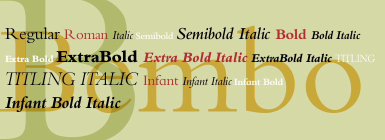
I bought the Monotype Bembo Book family a few years ago after learning it was a very close approximation to Edward Tufte’s personally-commissioned version of Bembo (ET Bembo). I started using it off and on for various documents and have developed quite an appreciation for its appearance, both under close-up scrutiny as well as the overall color of the page at a distance. Here is a Bembo specimen:
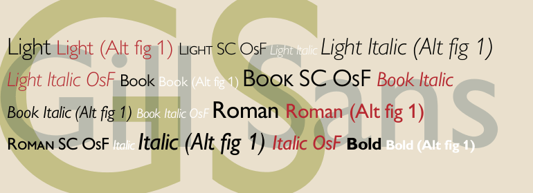
I was originally also using Bembo for chapter and section headings, but was never really satisfied with how Bembo looks at larger sizes or heavier weights. I started thinking I would go the direction of an old-school, geometric sans for these elements, and certainly would have chosen Futura if I hadn’t already dropped a fair piece on the Bembo Book family (>$100). At the end of the day, the only other geometric sans in the same class as Futura for my taste—and at the right price since it’s standard on Macs and PC’s—was Gill Sans, which incidentally is also a favorite of Tufte’s. (I do understand Gill Sans is overused in the UK, but not so much here in the States.) Here is a Gill Sans type specimen:
So while I didn’t initially intend to rip off the typographic design of every one of Tufte’s books… I have to give credit where credit is due and admit that these are some of the most beautifully typeset books I have ever seen.
Innovate in your own field (engineering in my case), borrow from the best outside of it (graphic/typographic design).
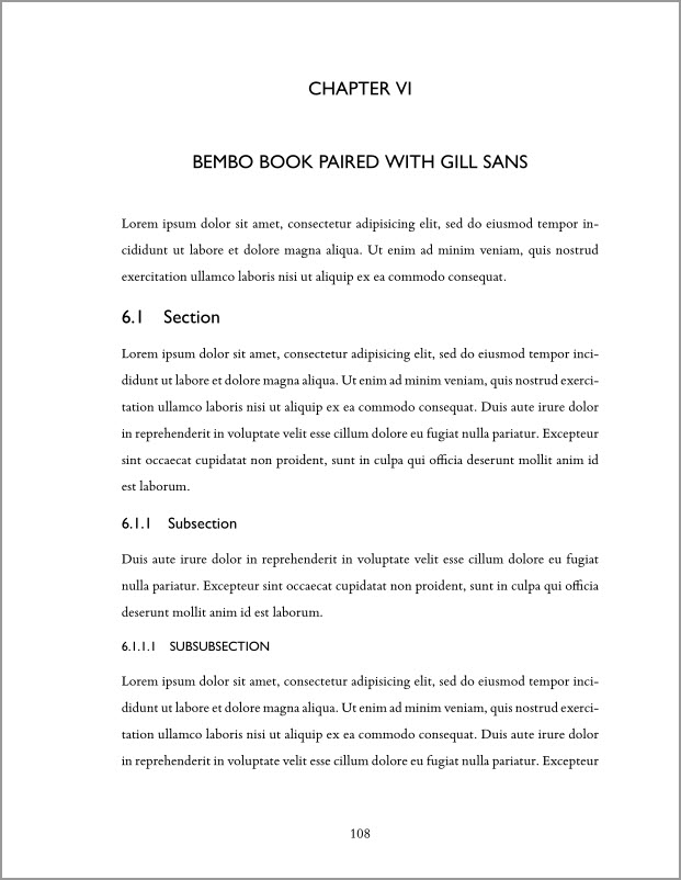
Here is a sample page to illustrate the result:
If you are interested in implementing the same effect in your LaTeX-generated thesis, you will have to use XeLaTeX with the fontspec package. Here is the code I use to invoke Bembo and Gill Sans:
% FONT COMMANDS
usepackage{fontspec}
defaultfontfeatures{Mapping=tex-text}
setmainfont[Ligatures={Common},Numbers={Lining}, Scale=1.1]{Bembo Book MT Std}

% HEADINGS with Gill Sans
newfontfamilyheadingfont{Gill Sans MT}
defchapterfont{Largemdseriescenteringheadingfont}
defsectionfont{noindentheadingfontLargemdseries}
defsubsectionfont{noindentheadingfontlarge}
defsubsubsectionfont{noindentheadingfontnormalsizemdseriesMakeUppercase}
A few final comments:
- Most university thesis style guides are so over-constraining that you don’t have much room to work optimizing characters per line, line height, etc. I tightened the line spacing enough that I don’t think the style reviewer will detect it isn’t doublespaced, but it’s nowhere near the elegance of the Classic Thesis LaTeX theme, which you should absolutely be using if your university’s style guide is lax enough.
- I may still purchase just the medium weight Gill Sans or Futura to make the headings pop a bit more. The bold versions of both are much too heavy for my taste.
- I am open to all suggestions for a moderately priced geometric sans.
Disclaimer: The above code will definitely not work out of the box in your thesis—you will have to edit your university’s thesis template to invoke headingfont for chapter headings, etc. Depending on how cleanly developed your thesis style is, you might can pull off something similar with the secsty package, but the Georgia Tech thesis class was far too hacked together for that to work for me. Also, depending on your system and where you get the fonts, the names may vary from what I have listed above.
Now to finish writing it.