02 Mar 2012
•
Academia
My department is currently interviewing faculty candidates, so life these days consists of a deluge of job talks. I want to make a few observations about post-talk Q&A;, particularly some suggestions for keeping things classy. So, to all who would ask questions after a seminar or conference talk:
- Compliment the presenter. Even if the talk had serious problems or was boring, starting off with a compliment makes you look dignified and classy. You could try: “First of all, thanks for an interesting presentation. I have a question about…” Or perhaps: “You are bringing exposure to an important area of research. Did you encounter issues with…” and off you go.
- Check your ego. This one is hard to classify, but everybody recognizes it when they see it. It is the opposite of classy to ask a question to (a) intentionally make the presenter look bad or (b) make yourself look intellectually superior. If you are a small person who needs this type of display to feel good about yourself, be assured that everyone else thinks you’re a tool.
- Know when to take it offline. If you ask a question, a follow-up to their response is appropriate. But once the Q&A; devolves into multiple back-and-forth exchanges, interrupt your one-way conversation and yield to the group. Simply suggest, “Maybe we could discuss this in more detail after the session.” This act of courtesy shows deference to other attendees. Don’t monopolize.
Basically, you are trying to avoid this scenario.
22 Feb 2012
•
Technology
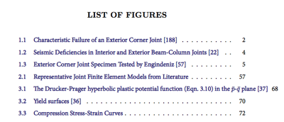
For all of LaTeX’s obvious charm, longtime users know that you still run into formatting issues from time to time. One such issue is how LaTeX has trouble handling line breaks (or line wrapping) in table of contents pages, which also applies to list of figures and list of tables pages. Here is what you might see:

Note Figure 3.1 (The Drucker-Prager hyperbolic…), which violates the right margin. It’s not just that it’s improperly aligned—sometimes entries like this will march right off the page. You don’t have to stand for this.
It turns out this arises from a problem with the hyperref package’s ability to insert a line break inside a link. Since I am using hyperref to make all TOC entries clickable (which is why the list is blue in the image above), if the caption is too long, it doesn’t know what to do.
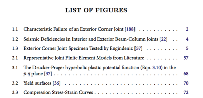
You can fix this issue by adding the option linktocpage to your hyperref stack. The tradeoff is that the list text is no longer linked; just the page number. Not ideal, but worth it to close this ticket without significantly altering the functionality of the TOC. Here’s the new output:

There, much better.
A few final notes:
- The
hyperref option breaklinks is supposed to fix this issue, but was unsuccessful for me.
- Some people actually suggest shorter captions as the solution to this problem. As Tufte would say, this is letting the cognitive style of your tool, not your message, drive the bus.
- You can always use the
caption[Short caption]{Long caption} format, which only inserts the portion in the [ ] in the TOC (works identically for caption/section/subsection/etc). This is how I’ve always corrected this problem in the past. I will still use it for really long entries, but would rather not worry about dual-captions for entries at or near a single line length.
10 Feb 2012
•
Design
Today’s xkcd comic on kerning is wonderful and painfully true.
Robert Bringhurst’s The Elements of Typographic Style should come with a warning: This book will ruin your ability to ignore typographic injustices.
Case in point: Sunday I was reading before bed and I couldn’t believe what I saw. The book I was reading actually had swash capitals BUT NOT COMMON LIGATURES (fl, fi, ffl, etc). The transgressions don’t end there, sadly. Wouldn’t you know the copy on the box this particular Bible came in does include common ligatures. The box has better typography than the book. Somebody punch me in the face.
Ignorance was bliss.
More about kerning:
09 Feb 2012
•
Academia
Tolerance for the unknown is par for the course in graduate research, so it was no surprise last night when I found myself daunted by the prospect of the next phase of my PhD, which involves a significant jump in the complexity of my simulations.
Talking it through with my wife, though, I realized I could trace the source of my anxiety to 4 or 5 key elements that I haven’t yet learned how to do in the FEA code I am using. Once I broke it down, I realized that I wasn’t dealing with numerous interdependent unknowns and simultaneous “equations”—I was dealing with 5 essentially unrelated components. A sparse, banded matrix! It suddenly felt so simple.
I’ll point now to a very practical bit of advice from Daniel Lemire on intellectual productivity when overwhelmed:
The secret is this: break down your task into small and easy chunks of work. And just do them! […] Sometimes you do not know how to break down the task. Do not worry so much about it. Break it down in some way and get working.
This advice applies especially well to projects that appear to possess a high level of interrelated, parallel issues. Perhaps the dependencies are real, but here is the news flash: you probably aren’t going to simultaneously solve a massively parallel, underdefined problem in your head. In that case, you discretize the problem into the maximum number of as-independent-as-possible components you can and work on each one at a time, iterating over the bunch until the system starts working.
Don’t miss the trees for the tangled forest.
Obvious. Self-evident. Difficult to actually do.
Now back to learning those 5 things.
26 Jan 2012
•
Technology
One way to add significant value to your blog is through an effective archives page. I have been asked several times how I created the archives page on this site, so I thought I’d document the process here. Here is a snippet from my archives page:

Here are some reasons to consider adding or tweaking your archives page:
- Give readers a fast overview of your site’s focus and history.
- Categorized archives are the most usable (and comprehensive) way to view related content on your site.
- Keep older content from dying by making it easy to find. If your site has a thousand or more posts, this is the only I way I can efficiently explore your old content—much of which I definitely want to see.
- It helps you get a feel for your blog’s trajectory and distribution of content.
- You’ll feel good seeing how many blog posts you’ve written. ;)
- Aside: Month-based archives (just a list like: January 2011, December 2010, …) are useless from a navigation/organizational perspective, except perhaps to demonstrate the longevity of your blog.
The aesthetic inspiration for my archives page came from something I had seen on several Jekyll-based blogs, such as this one. The functional inspiration came from the practical value I found in Michael Hyatt’s archives page.
My design objectives were simply: display an introduction, list all pages, then list all posts per category (preceded by the category description), using the date with monospace font as a pseudo-list style like the Jekyll example above.
After some trial and error, I finally figured out how to pull this off, but just be warned: I’m no PHP developer, so proceed at your own risk.
Create an archives template
Embedded below is the WordPress page template that I created to achieve the above style. Basically, this is nothing more than a few calls to core WordPress functions, such as wp_list_pages or get_categories. You can find more information on the WordPress Codex about page templates or by searching on any other function name.
Note that this is set up for the Standard Theme (which I use and recommend), although the idea should be simple enough to modify for whatever theme you happen to use. In that case, you can probably copy most of the contents of the entry div into a template page for your theme.
Once you’re done, you will need to FTP your new archives template to your theme files directory in the wp-content directory.
Here is my archive page template: Archives-JBD.php:
 <div id="content" class="col-full">
  <div id="main" class="col-<?php echo main_content_orientation(); ?>">
   <div class="post">
    <h2 class="title">

    </h2>
    <div class="entry">

     <h3>

     </h3>
     <ul>

     </ul>
     <h3>

     </h3>
     cat_ID . '&posts;_per_page=-1');
     ?>
      <h4>
       cat_name; ?>
      </h4>
      <p>category_description ?></p>
      <ul class="archive">

        <li style="font-weight:normal !important;">
         <span> »</span> <a href="<?php the_permalink() ?>"></a>
        </li>

      </ul>

    </div>
   </div>
  </div>

 </div>
Create the archives page
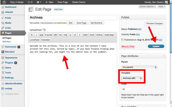
Create a new page. Call it “Archives”. Write your page introduction. Apply your archives page template (it will show up here after you’ve uploaded the file to your theme directory). Hit publish/update. It should be live now.

Style it
To achieve the list style I ripped off Tom Preston-Werner, you need to wrap the date with a monospace, light gray, and smaller font. To do this, add the following to your theme’s custom.css file:
/* Archive page list styling */
ul.archive { margin: 0 0 15px 0; padding: 0 0 0 10px;}
ul.archive li {list-style-type: none; }
ul.archive span { color: #666; font-family: monospace; font-weight: 500; font-size: 80%; }
If you dig around in the WordPress Codex, you’ll find there are a lot of different options for creating a page like this. You can create an uncategorized, chronological list of all posts ever written. You can find a handful of plugins that create an archives page. Tentblogger also has a nice archives page guide.
Regardless of how you decide to pull it off, know that people like me who discover your blog will often head straight to the archives and load a handful of tabs based on interesting titles I see in the list. The easier you make it for us to find your best material, the more we’ll spend time reading your site.
